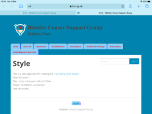
This page has examples of what the screen should look like.
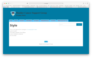
There are three basic designs. Large (16:9) Medium (4:3) and Small (Mobile Devices).
The layout for Large has left and right margins.
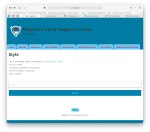
The layout for Medium doesn’t have margins.
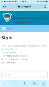
The layout for Small doesn’t have margins and the menu is changed to a drop down menu indicated by the “Hamburger”
The Large screen layout looks like this.
The Medium screen layout looks like this.
On a smartphone it should look something like this.
Note:- the menu is now the “Hamburger”.
This image show a problem the menu is split over two lines.
Note:- This is not how I want it to look since the menu bar is split over two lines.
